
Reporting with Intention: How to craft a meaningful narrative with your findings

Written by Alyssa Reynolds
In our last journal entry, we walked through how we approach data analysis at Elevate—reviewing context, cleaning datasets, staying focused on key questions, and identifying clear findings. Once you’ve organized your data and articulated the results, the next step is to figure out how to communicate them in a way that people can understand, remember, and act upon. Reporting isn’t the final stage of an evaluation, it’s the first step in making meaning that informs action.
At the heart of it all, evaluation is about action. It is about making sure that people have the right information, in the right format, at the right time, to take action. Depending on your goals and your audience, these actions might include:
Making changes to strategies and improving processes (internal)
Whether or not to help you advance your mission (external)
Deciding whether or not to give money or time to your organization (external)
Below is a roadmap that will serve as our guide through these considerations for intentional reporting.

Audience & Goals
Who are you communicating to?
How do you hope they take action?
By the time you’re writing a report, you may be sitting on pages of analysis, cross-tabs, and quotes. But your audience—program staff, partners, funders—doesn’t need all of that detail first. They need the headline.
Begin by identifying your intended audience(s). These may include internal folks like leadership, staff, or board members. Or, it may be external audiences like funders, clients/service population, or the broader community.
Then, ground yourself in the purpose or intention of the evaluation:
What questions about our program or organization did we set out to answer?
What decisions or actions is this data meant to support?
What do stakeholders need to walk away knowing or be motivated to do?
Leading with purpose helps keep your reporting focused and avoids overwhelming readers with every interesting data point.
Pro tip: Write down, in one sentence, what you want the main takeaways to be for your audience. You may have more than one intended audience, and the actions you hope to motivate them to take might vary. Do this for each audience.
Supporting Information
What will compel them to take action?
How do they need to feel, what do they need to know?
What information or context do you have that will equip them to interpret the results accurately and do the thing you need them to do?
When thinking about what information might best support your main ideas, consider different types of data and different data sources. You might not know how much you already have at your fingertips, including publicly available data that might reinforce your or add context to your narrative.
Quantitative data refers to data that is quantifiable. Some examples include statistics, some public data, demographic data and other outputs, assessment scores or other outcome measures, and closed-ended survey questions. This type of data is best for answering questions like “how many” or “how much”, providing perspective or comparison, and conveying breadth.
Qualitative data refers to narrative data, or data that is in someone’s own words. Sources for qualitative data include interviews, focus groups, and open-ended survey questions. Stories, anecdotes, and quotes can also be used to support other data in your report. Qualitative data is best for answering “how” or “why” questions, providing nuance and depth, conveying meaning, and discussing sensitive topics.
When selecting and organizing your content, it is also important to consider the flow of your story. It may be helpful to map out your story first using an outline or a storyboard to ensure that you are connecting all the dots for your reader.
Pro tip: Consider both the logical and emotional parts of our brains when crafting your report. A compelling narrative benefits strong data points, interesting visuals, and rich supporting anecdotes.
Select a Format
Things to ask yourself:
How much context is needed?
How much time will someone spend with this report?
What does someone need to do with this information?
What is their level of comfort with data?
How much storytelling is needed/appropriate?
When it comes to selecting a format for your reporting, there are many options. Traditionally, narrative reports, executive summaries, and slide decks have been the most common ways to share evaluation findings. While these formats may be required by boards or funders, they may not be the best format to communicate information to other audiences like the general public or even your own staff.
The general public may need more context about who your organization is and what they do, but they might spend less time and attention on what you are putting out. Infographics, social media posts, and sharing data on your webpage may be helpful ways to reach that audience.
Your organization's staff will likely need less context than the general public, and they might need more frequent updates on evaluation outcomes. A report card or dashboard with key data points that can be easily updated may be a better format for sharing findings with staff.
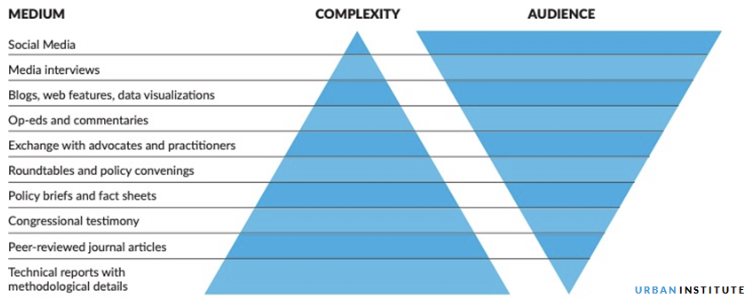
This graphic from Urban Institute visualizes the complexity and reach of different reporting mediums. This may be a helpful tool when deciding upon format for different audiences. It is important to consider complexity when choosing a format not only because of the amount of time folks may spend with your report product, but also the varying levels of data literacy across audiences. Data literacy refers to how comfortable with or how much exposure someone has had to interpreting data or data visualizations.
Pro tip: Start with your most intensive report product first. You may be able to reuse visuals and language from this report to make less complex products like social media posts or report cards. If you aren’t required to craft a full technical report, you can still be intentional about how to reuse visuals key takeaways across deliverables and with multiple audiences.
Visualize Your Data
One of the most impactful ways to communicate with data and to draw in your audience is to use high quality visuals. In our next blog post, we will walk you through selecting chart types and how to design charts for clarity.
Equitable Storytelling
“Behind every number there’s a person making decisions: what to analyze, what to exclude, what frame to set around whatever pictures the numbers paint. To make a statement, even to make just a simple graph, is to make choices, and in those choices human imperfection inevitably comes through.”
There’s a common belief that research and evaluation are inherently objective. But evaluation is not neutral. Data may feel factual, but every step that leads to those facts—from defining success, to choosing what questions to ask, to deciding how to interpret results—is done by people. And people are never neutral.
Our lived experiences, identities, roles, and many other factors shape the way we see the world and the way the world sees us. They shape what we believe is important, what we notice, and what we overlook. Sometimes this shows up as simple human imperfection. Other times, especially in institutional contexts, these choices can intentionally reinforce existing systems of oppression.
The first step in doing evaluation responsibly is understanding what influences our own perspective. We have to slow down and examine what we each bring into the room: our assumptions, our biases, our blind spots, and the ways these may affect the stories we tell with data. This awareness is foundational to ethical, culturally responsive evaluation.
In our particular context of non-profits and philanthropy, the way we report can become extractive or exploitative. In spaces like fundraising, where the goal is often to provoke an emotional response, we can unintentionally center donor appeal instead of centering the people whose experiences we’re describing. Ethical storytelling means honoring the responsibility we have to portray communities in ways that are accurate, dignified, and empowering.
So, what can you do to tell stories more equitably?
Ensure consent and confidentiality
Learn and adopt practices in culturally responsive evaluation
Use appropriate and inclusive visuals and colors
Engage your stakeholders in reviewing and creating stories
When we name that evaluation is not neutral, we open the door to doing it more intentionally and more justly.
Crafting an intentional report isn’t just about presenting findings; it’s about shaping understanding and fueling the actions that move your mission forward. When we pair clear insights with purposeful storytelling and a deep awareness of our own positionality, we create reporting that is both useful and respectful of lived experiences. As you prepare to share your next set of findings, take a moment to revisit your audience, your purpose, and the story you want to tell.